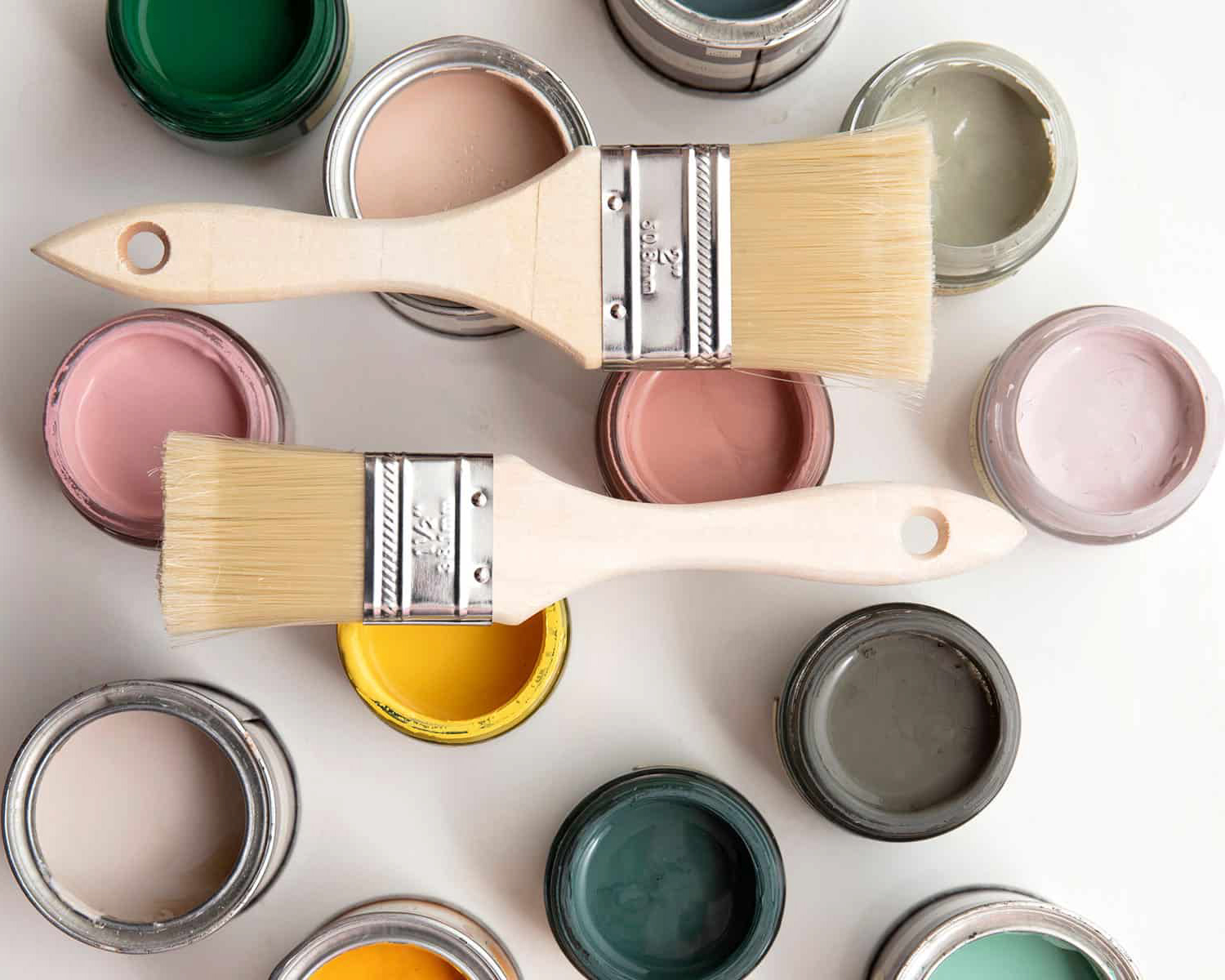
Every year, color experts and paint brands alike forecast a signature color that embodies the essence of the new year. These tastemakers’ picks influence everything from fashion and pop culture to home design. Last year, we saw a movement from cool tones to warmer hues and more vibrant colors compared to the dominant neutrals of years past. So what’s in store for 2024? This year sees a wide variety of hues, but there is definitely a common thread. They are all nature-inspired tones that provide comfort and versatility. Ring in the New Year and kickstart your next color refresh with our handy cheat sheet to all of the 2024 Colors of the Year…
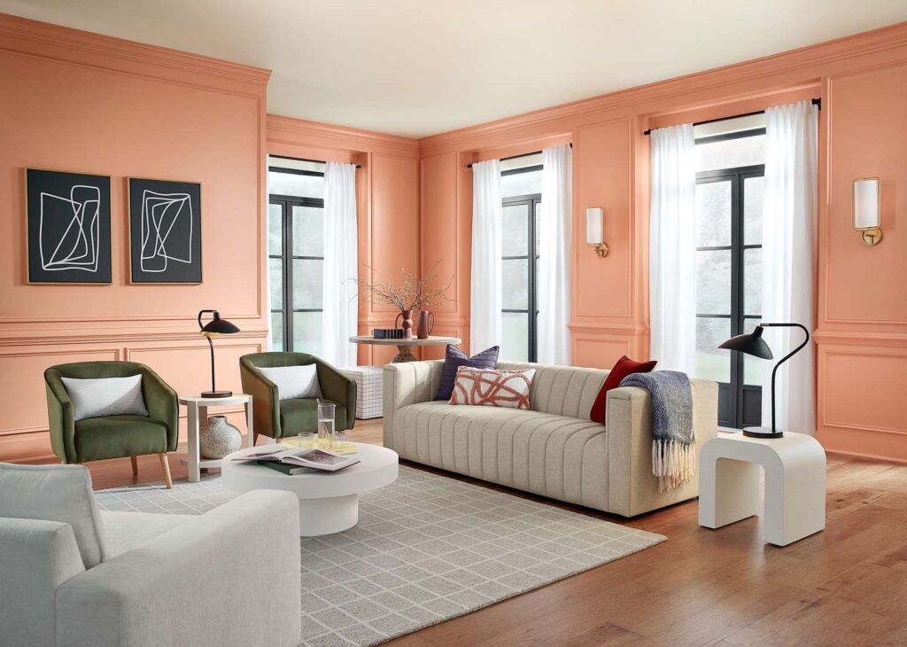
Pantone: Peach Fuzz
A gentle orange-pink shade that serves as a reminder to slow down and care for ourselves and one another. “We’re going through a lot of turmoil in our lives, and we have a need for a color that’s nurturing,” Pantone color specialist Leatrice Eisman shares. “It’s a warm and cozy shade. And it’s very tactile. We feel that at a time like this, tactility is really important — to touch other people and gather them into our homes.”

Stacy Zarin Goldberg | Elle Decor
Benjamin Moore: Blue Nova
Violet and blue come together in this elevated, sumptuous hue. “Blue Nova is an alluring mid-tone that balances depth and intrigue with classic appeal and reassurance,” says Andrea Magno, color marketing and development director at Benjamin Moore.

Benjamin Moore
Sherwin-Williams: Upward
A breezy, blissful blue. “Upward represents the gentle forward momentum in all of our lives,” according to Sherwin-Williams director of color marketing Sue Wadden. “It brings to life that carefree, sunny day energy that elicits a notion of contentment and peace. With this color, we invite our consumers to take a pause and infuse a new sense of ease and possibility into their spaces—one that doesn’t overwhelm, but rather establishes meditation and tranquility.”

Sherwin-Williams
Dunn Edwards: Skipping Stones
A serene and steely blue with hints of green and gray. “Skipping Stones feels like a daydream and can add a sense of mystery and thoughtfulness to any space,” says DeMing Carpenter, color expert at Dunn Edwards. “It’s part of the resurgence of blue and represents a shift away from the bold, warm-toned colors we’ve seen gain popularity over the past few years.”

Dunn Edwards
Valspar: Renew Blue
A nourishing, green-influenced blue that creates a sense of peace wherever you place it. “Renew Blue is an incredibly versatile and all-season shade that anyone can envision in their space. Inspired by fleeting elements like fog, mist, clouds, and glacier lakes, Renew Blue elevates the everyday mood, encourages self-expression, and evokes a feeling of balance and calm, with a twist of unique spontaneity,” says Sue Kim, Valspar director of color marketing.

Valspar
PPG & Glidden: Limitless
A warm, nearly-yellow neutral that can be paired with almost any color scheme. Glidden refers to Limitless as “anything-but-yellow honey beige,” because it was designed to blend with both warm and cool tones. “This modern neutral is as adaptable as its name implies and is taking the place of cool neutral tones that are so last year,” shares Ashley McCollum, color expert for Glidden.

Glidden
Behr: Cracked Pepper
A moody almost-black charcoal hue that adds sophistication to any space. “We recognize the growing desire for using darker colors throughout spaces,” comments Jodi Allen, global chief marketing officer at Behr Paint Company. “Adding a soft black like Cracked Pepper evokes a sense of confidence and individuality that we want all of our customers to feel after completing a project.”

Behr
HGTV Home by Sherwin-Williams: Persimmon
“Persimmon balances the energy of tangerine with grounded neutral undertones, making it perfect for spaces like living rooms and kitchens as it promotes positive relationships and conversation,” declares Ashley Banbury, Sherwin-Williams‘ color marketing manager. “The beautiful shade helps rejuvenate a space while bringing unique design visions to life.”
HGTV Home by Sherwin-Williams
Dutch Boy: Ironside
A dimensional and deep olive green with black undertones that soothe and reassure. “We’re taking a comforting approach; embracing restoration and nature, while bringing harmony into the home,” states Dutch Boy’s senior brand manager Michelle Bangs. “Creating a space for wellness should be a driving factor in everyday life.”
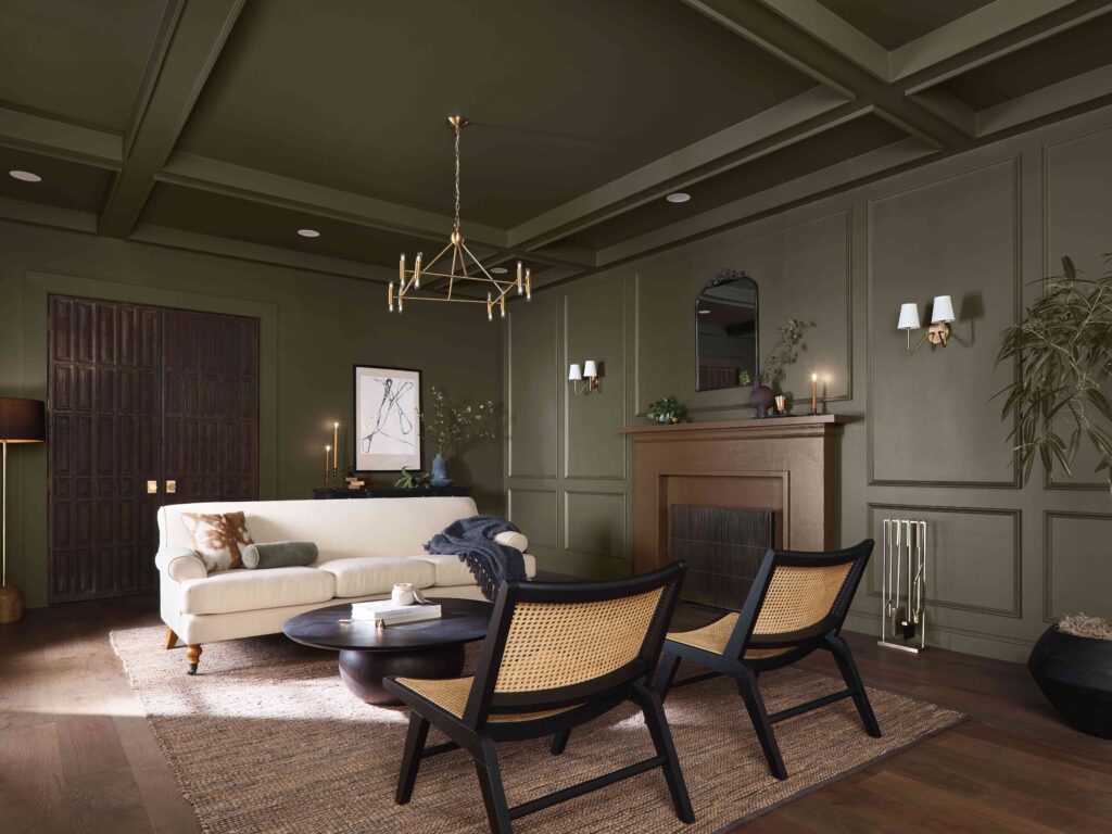
Dutch Boy
Do you think the experts got it right? Let us know what you think about these color picks in the comments below. We would love to hear from you!


